With more than half of all internet traffic coming from mobile devices, having a website that works only on desktops is no longer enough. Users expect websites to load quickly, display clearly, and navigate easily on their smartphones. A mobile-friendly website is not just a nice-to-have—it’s a necessity for business growth.
Professional Website Design and Development Services Companies understand this shift and focus on creating websites that are responsive, user-friendly, and optimized for mobile performance. In this blog, we’ll explore why mobile-friendly websites matter, the benefits they bring, common mistakes to avoid, and tips for effective website optimization.
The Rise of Mobile Internet
Mobile internet usage has skyrocketed in recent years. From browsing products to reading blogs and making purchases, more users rely on their smartphones than ever before. Key trends include:
- The majority of searches now happen on mobile devices
- Users expect websites to adjust automatically to any screen size
- Slow-loading or poorly designed mobile sites result in higher bounce rates
A professional Website Design and Development Services Company ensures your website delivers a smooth experience, keeping users engaged regardless of the device they use.
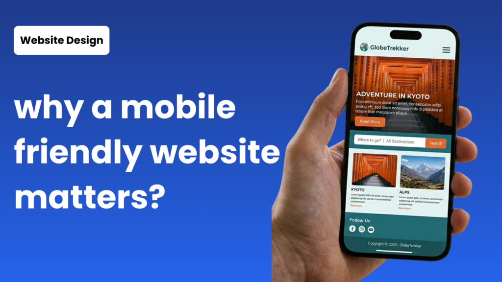
What Makes a Website Mobile-Friendly
A mobile-friendly website adapts seamlessly to different screen sizes and offers easy navigation. Key features include:
- Responsive Layouts: Pages adjust automatically to fit screens of any size
- Fast Loading Speed: Mobile users often leave sites that take too long to load
- Touch-Friendly Navigation: Buttons and menus that are easy to tap
- Readable Fonts and Images: Text and visuals that display clearly without zooming
- Optimized Media: Images and videos designed to load quickly without losing quality
These elements are essential for effective website optimization and improving user experience on mobile devices.
Benefits of a Mobile-Friendly Website
Investing in a mobile-friendly website provides numerous advantages:
- Better User Experience: Easy navigation and clear content keep visitors happy
- Higher Engagement: Users stay longer and interact with your content more
- Improved Conversions: Smooth forms and checkout processes encourage action
- SEO Advantages: Google prioritizes mobile-friendly websites in search results
- Brand Credibility: Professional, responsive websites increase trus
A Website Design Services Company ensures these benefits are fully realized through smart design and optimization techniques.
Common Mobile Website Mistakes to Avoid
Even businesses with good intentions sometimes make errors that hurt mobile usability:
- Slow-loading pages
- Non-responsive layouts that require pinching and scrolling
- Tiny buttons that are hard to click
- Large images that slow down the site
- Forms that are difficult to fill out on small screens
Working with a professional Website Design and Development Services Company helps avoid these mistakes, providing a smooth, user-friendly experience across all devices.
Tips for Effective Website Optimization
Optimizing your website for mobile is simpler than it seems when done strategically:
- Use responsive design templates
- Compress images and optimize media for faster load times
- Prioritize key content for mobile users
- Regularly test your site’s mobile performance
- Use analytics to understand how visitors interact with your site
These website optimization strategies ensure your site is fast, engaging, and conversion-ready.
Mobile Optimization and SEO
Mobile-friendliness directly affects search engine performance. Google now uses mobile-first indexing, meaning your site’s mobile version is what determines your search rankings. Benefits include:
- Better visibility in search results
- Faster page load times
- Lower bounce rates
- Enhanced user experience
A Website Design Company knows how to implement SEO-friendly mobile optimization, helping your website perform well in search engines while delighting users.
Partnering with a Professional Company
Hiring a professional Website Design and Development Services Company like Websonstructive brings expertise and peace of mind:
- They create responsive, mobile-friendly designs
- Implement proven website optimization strategies
- Ensure your website aligns with your business goals
- Provide ongoing support and updates to maintain performance
Partnering with experts saves time, avoids costly mistakes, and ensures your website delivers results across all devices.
Conclusion
A mobile-friendly website is no longer optional—it’s essential for business success. From improving user experience and engagement to boosting SEO and brand credibility, the benefits are clear.
Investing in website optimization and partnering with a professional Website Design and Development Services Company ensures your website works seamlessly on every device, providing a smooth experience for visitors and supporting your long-term growth.
Ready to make your website mobile-friendly? Contact us today and start optimizing your site for maximum impact!
